Thursday, December 31, 2015

New Year, New Blog

Art courtesy George Arents Collection, The New York Public Library. 
Retrieved from http://digitalcollections.nypl.org/items/510d47e4-8261-a3d9-e040-e00a18064a99
Starting January 4, 2016, we invite all Blogger.com and Blogspot.com readers -- and everyone interested in corporate history and business anniversaries -- to follow us at our blog's new home, http://www.corporatehistory.net/blog/

The CorporateHistory.net team sends best wishes for a superb New Year's weekend!

Wednesday, December 16, 2015

Microsoft Stories

http://news.microsoft.com/stories/index.html
Echoes the classic company print magazine but optimized for online reading.
Remember company magazines and employee newsletters? All of us corporate history researchers and archivists have paged through them. They proliferated through the 20th century as the chief means of internal and external communications, and they remain a source of memory-keeping for companies without formal archives or annual reports. These publications were usually quite good, with news and features by top-notch writers (often journos who jumped ship) and strong photography to match. The Microsoft Stories blog is today's version of these mags: the requisite C-suite foreword (Brad Smith's "In the Cloud We Trust" is as long as a keynote speech and may have been one), numerous well-written profiles, and clever cartoons by Hugh McLeod that I particularly enjoyed (example below). Compared to 20th century print publications Microsoft Stories actually goes one better, as it can function as a recruitment tool as well. My only cavil is that it may offer too much of a good thing, at least in one place. The home page scrolls down to offer dozens of articles. I'd rather have a pull-down list of extras to choose from. But, all in all, a great example of corporate storytelling.

From cartoonist Hugh MacLeod’s "illustrated guide to life
inside Microsoft," part of the Microsoft Stories site
 

Monday, December 7, 2015

Oral history of a 1950s company town

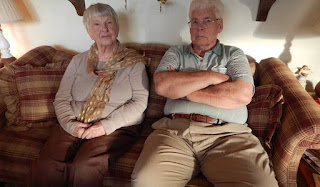
Norm and Betty Jo Anderson, Piketon, Ohio 2015.
Credit: Lewis Wallace, Marketplace.org
Kudos to Lewis Wallace of Marketplace.org for a fascinating oral history of Piketon, Ohio, which is struggling with Cold War era nuclear cleanup. It was once the quintessential company town. Great use of voices, especially those of Norm and Betty Jo Anderson. Norm: 
“It’s hard to tell people of the magnitude of those buildings,” [The one he worked in had 33 acres to a floor.] "And those were concrete floors. Can you imagine pouring 33 acres of concrete?” Now they're demolishing it.
Nuclear cleanup work sustains ailing Ohio town | Marketplace.org
http://www.portsvirtualmuseum.org/history-goodyear.htm
 

Thursday, December 3, 2015

Turning Customers Into Cultists

Illustration (c) Matt Chase from The Atlantic, December 2014
"Turning Customers Into Cultists" by Derek Thompson ran in The Atlantic and is
well worth a read or re-read. It explains why the release of a new iPhone rouses buyers to "squat for hours outside the nearest Apple store like Wiccans worshipping before Stonehenge" (ha!). Thompson also explores how brands are learning to cultivate identity and community in their corporate storytelling -- not quite to the extent of cult-ivating, we hope.

Tuesday, November 24, 2015

150 Years at Shaw University

Kudos to Shaw University, the US's first historically black college, on its upcoming 150th anniversary. Shaw has obviously put time and thought into a far-reaching campaign. Business anniversary tip: These key elements, highlighted on a dedicated section of Shaw's  website, are worth emulating:
  • Timeline with good photos and visuals
  • Invitation to alums and friends to Share Your Story
  • Events such as a 150 Voices concert, Bear Witness gathering, Founders' Convocation, and gala dinner dance  
  • Blount Street Mural Project in the surrounding community
  • Invitation to donate--straightforward, well-written--a must for nonprofits
The only thing that may be missing is a print component. Is there a book or publication to mark this momentous landmark? I'm especially curious because Shaw has been open to all races, creeds, and genders from Day One, a most unusual attribute for a college founded in 1865. (The photo below shows the class of 1907. My own alma mater, Rutgers College, was founded in 1766 but did not admit women until 1972.) Shaw alums include New York State's first black legislator, Edward A. Johnson (class of 1891), pioneering pilot and flight instructor Ida Van Smith (class of 1939), and Angie Brooks, president of the UN General Assembly (class of 1950). 
 

Wednesday, November 18, 2015

How Authentic Is Your Brand?


Consumers say they want 'authentic' items and brands, but what does that mean? Corporate  storytelling plays a big part in backing up those words. The New York Times makes this point: "You could argue that these stories are a reaction against goods delivered by container from China, to be bought at Walmart." http://nyti.ms/1BdFGfA.  

In the bracingly sardonic style that The Economist musters so well, a November 14, 2015 article by Schumpeter states: "Shoppers at Whole Foods can peruse scintillating biographies of the chickens they are about to casserole . . . . authenticity is far easier to pull off when your product has some real-world qualities that its competitors lack. The most striking recent example is that of America's craft beers." http://econ.st/1Oe5LTc (Illustration copyright 2015 Brett Ryder; it appears with the The Economist piece.)

Your brand storytelling develops authentic muscle when it's based on your corporate history.


Tuesday, November 10, 2015

Stay Tooned for King Features' 100th Anniversary Gift

On Sunday, November 15, King Features Syndicate will celebrate its company anniversary with a fun freebie for US newspaper readers: a 16-page insert featuring KFS strips from Krazy Kat and Popeye to Flash Gordon, Beetle Bailey, Blondie and Dagwood (my personal favorite), Prince Valiant, and dozens more. Business anniversary tip: Could your organization do the equivalent, using its own legacy images and distribution system? 

Better yet, King Features also commissioned a substantial anniversary book, shown above. 

Mainstream cartoons in newspapers have gotten a bit soft in the past decade, but great stuff can still be found in the monthly Funny Times and elsewhere. And, of course, artists/writers such as Alison Bechdel have transformed the genre. Cartoonists with a bite are among the undersung heroes of American culture.

Tuesday, November 3, 2015

50 Years of Space History in 20 Pages


While space travel isn't my favorite subject, I'm nonetheless impressed with this 20-page publication covering 50 years of what's now known as the Neil Armstrong Flight Center. It came to our attention as a fellow winner of an 2015 APEX Award. The cover is a bit busy and hard to read, but the interior is organized magazine-style. Business anniversary tip: Test your cover for readability at small sizes.
 

Per the APEX Awards judges' review: "This special issue, focused entirely on the 50 year history of the Neil Armstrong Flight Research Center, carries a lot of appeal. Interesting spreads, dramatic, well-chosen photos, in-depth captions — and writers and editors who know how to convey often complex technical and engineering subject matter in a very interesting and engaging way — make it a keeper." 

See the whole publication here: Flight Loads Lab at 50. Congrats to creators Jay Levine, X-Press Editor and Christian Gelzer, NASA Armstrong Historian, Jacobs Technology/NASA Armstrong Flight Research Center, Edwards, CA

Monday, October 26, 2015

CorporateHistory.net now mobile-friendly

We're celebrating our own 10th business anniversary with a fresh new website. Check out http://corporatehistory.net on smartphone, tablet, or good old desktop and tell us what you think. Kudos to our intrepid web designers at cdeVision in Holyoke, MA -- Bill and Antonio, you're the best.

Monday, October 19, 2015

How to Write a Great Website Timeline (Part 3)

History faces tough competition on the Net: when was the last time you shared a website timeline? Before we talk about the details of General Electric’s timeline, let’s note that not only were we intrigued enough to look through each of the 12 pages of the timeline (starting with 1878), but we spotted two items so irresistible that one of our writers shared them on Facebook.

What makes General Electric’s web timeline so great? Let’s look at it in terms of the questions and guidelines in our first post on this topic.

1. Audience(s). The timeline is focused on GE’s spectacular achievements across a wide range of fields, over more than a century. There’s no mention of mergers and acquisitions, but after reading a few pages, we were sorry we hadn’t invested in its stock a century or so ago.

2-3. Major events and structure. If you want a quick overview of the company history, the leading paragraphs of the 12 segments combine to form a coherent story. The breaks in the timeline are irregular (1878-1904, 1905-1912, etc.) - presumably so that major events can be featured in the segment’s leading paragraph.

For those who want more information, the second section -- below the leading paragraph on each page -- offers a series of 8 or more major events in a slideshow of a very superior sort. Each major event has a well-chosen photo and a brief description of the event and its importance. (See #4 below.) The navigation bar beneath each event (with simple, obvious left and right arrows) summarizes this major event in a few words, and states how many events are in this particular sequence. Someone at GE knows how to work with short attention spans!

4. Context. The text for each major event puts corporate history in the wider historical context. For example, from 1913: “GE develops the hot-cathode, high vacuum X-ray tube. By replacing the cold aluminum cathode with the hot tungsten filament in a high vacuum, the company could provide tubes with better control and greater output than had ever been achieved. The development greatly facilitates the use of X-rays for diagnosis and treatment.”

5. Images. The leading paragraph on every page has an image, and so does every single major event. The images are large enough to see, but small enough to flip through easily: a tricky balance to achieve.

Below the leading paragraph and the major events is a wonderful third section: a series of GE advertisements from the period. As a brief history of advertising styles these are great fun. But even better: every single one shows how cutting-edge GE’s products were and still are. (1939: “General Electric Television Receivers! Thrilling reception of exciting events as they happen!”)

6-7. Layout and navigation. The three-part layout for each page of the timeline is easy to grasp: leading paragraph, series of major events, sample GE advertisements.

The layout is the sole point where the GE website timeline has a flaw. The header image is a photo of Thomas Edison, with links to his bio, GE’s research, and GE’s past leaders. On a laptop, this header is so large that it takes up all the above-the-fold screen real estate. We assumed this was due to the fact that the page was designed to be mobile-friendly ... but then we discovered that on a smartphone, too, the header image is so large that the tabs and leading paragraph are pushed to the next screen.
This would barely matter, if it didn’t discourage visitors from finding the excellent content below the header image. Fortunately there’s an easy fix: make the header shorter top to bottom (much wider than its height).


But that’s a minor quibble. Overall, GE provides a great example of a website timeline done right.

Monday, October 12, 2015

How to Write a Great Website Timeline (part 2)

Last week we offered guidelines and suggestions forwriting a great website timeline. This week, CorporateHistory.net looks at the timeline on the website of Pepsico, a corporation that has plentiful resources and more than a century of company history. Sadly, Pepsico’s timeline isn’t spectacular.

Pepsi’s timeline is a single series of dates and events, with the most recent date at the top. A tab option at the top allows readers to skip from decade to decade.

Kudos to Pepsi’s designer for the layout, which is simple and elegant. The font for the years is easy to read, and a vertical line indicates the direction of the time flow. More kudos for the well-chosen and plentiful images. Of the 70 or so entries, 28 have illustrations.

Unfortunately, the text of the entries is subpar. We have no clue which of the 70-odd events are most important in Pepsi’s corporate history. For example, the inauguration of the first Pepsi-Cola operation in China (1982) is immediately followed by Frito-Lay’s introduction of Tostitos (1981). Given this mix of topics, we don’t even know whether the timeline is aimed at consumers or potential investors.
But much worse comes (or doesn’t) at the end of the timeline. Pepsi was founded in the 1890s, but the company history from then until 1966 is summarized in one very short paragraph. Most of that paragraph consists of names of CEOs, rather than storytelling. There’s not a single image. What a waste of a great history! If people have been loving your product for over a century, why not flaunt that fact with vintage ads, logos, and photos?

Next week, we’ll see how another major corporation handled its website timeline. (Hint: much better!)


Monday, October 5, 2015

How to Write a Great Website Timeline (Part 1)

Like a well-written corporate history, a well-written website timeline can be a great marketing tool: it can set your organization apart from its competitors, let you brag a little, and tell your story in a way that makes your company memorable. In decades of writing corporate histories, we’ve created dozens of timelines and looked at hundreds more. (For some examples, see our blog posts tagged with “web timelines.”) In the next two weeks, we’ll look at the website timelines for two corporations that have more than enough resources to make wonderfully effective timelines ... But did they?

Here’s CorporateHistory.net’s series of questions and guidelines for writing a great website timeline.

1. Consider your audience(s). Will your readers be your clients or possible investors? In other words: will they be more interested in your products, or in your mergers and acquisitions history? Consider separate timelines, if appropriate.

2. Use major events as centerpieces. Given your target audience, what are the six to eight major events in your company history? Make sure these don’t get lost in a barrage of less important data.

3. Build story into the structure. Given that website visitors have notoriously short attention spans, can you make your timeline a connected story? A series of problems and solutions? A brief history of a niche subject, with your company in a starring role? A humorous escapade, like Kentucky Fried Chicken’s timeline narrated by Colonel Sanders?

4. Layer in larger timelines—maybe. Do you want to keep readers laser-focused on your company, or will you set your company’s achievements in the wider framework of science, business, politics, or pop culture? Will your framework be your company, your community or industry, the United States, or the world?

5. Add images and captions. What will you use for visuals: current or archival photos, logos, advertisements? Any item with an image will get more attention than an item with only text. Captions will get more attention than text. Choose your visuals and captions accordingly.

6. Strategize the structure. Will you have one long timeline, or split it into or sections? If sections, what are the best divisions? Decades are easy and obvious, but if your major achievements came in 1932, 1939, 1955, and 1959, consider breaking the timeline in a way that gives those dates get more attention. Don’t forget to mark business anniversaries!

7. Make navigation easy. Is the layout easy to understand? (In July, we commented on Boeing’s bafflingly complex timeline.) If you’re using tabs for sections of the timeline, can readers see that option on both laptop and mobile screens?

Next week, we’ll analyze how one major corporation handled its website timeline.


Wednesday, September 30, 2015

Easiest Marketing Tip Ever

For marketing purposes, the end of one month equals the next month. Today is September 30, and in the past three days I've received five marketing e-newsletters dated "September." "Yikes," I think to myself, "these folks do run late and are desperately playing catch-up." But if they'd changed the date on the masthead to October, I'd think, "Congrats, these folks are on top of things by issuing their newsletter a few days early." 

So what if changing the date means skipping a month? Get out in front of your marketing instead of falling far behind it.

This advice applies in spades to corporate history. History doesn't happen overnight and it can't be reconstructed overnight. Business anniversary books, websites, timelines, and campaigns take time to develop. When your organization has a milestone coming up in a year or two or three, allow plenty of lead time. Your project will go more smoothly and it will cost less.

Monday, September 21, 2015

Graphic Design USA Award for CorporateHistory.net's BAYADA Book

BAYADA history book at company's annual Awards Weekend. Clients extraordinaire!
Left to right: BAYADA manager Janice Lovequist, author Chris McLaughlin,
editor/publisher Marian Calabro, and BAYADA senior associate Stephanie Smith.

Thrilled to report that BAYADA: 40 Years of Compassion, Excellence, and Reliability, created and published by CorporateHistory.net, is a winner in the Graphic Design USA Health + Wellness Awards competition. Honors went to just 125 of the 1,000+ entries. Kudos to art director and production manager Chris Reynolds, who embodied excellence and reliability through many long nights and right up to the press run; the pros at Penmor Litho and Riverside Bindery, who fussed over every detail down to the curves of the debossed dove’s wings under the book jacket; author Chris McLaughlin, a model of dedication; and our phenomenal clients, including the awesome Baiada family and ace in-house project runners Janice Lovequist and Stephanie Smith. Thank you for letting us tell your story!

Tuesday, September 8, 2015

Writing Well for Business Success Q&A


Published Sept. 2015 by St. Martin's Press
Writing Well for Business Success by Sandra E. Lamb fills a big gap in how-to books for the workplace. Sandra is an award-winning author, journalist, lecturer, and business consultant. She and I are members of the Authors Guild and American Society of Journalists and Authors.

I can vouch for this book’s value because I’ve taught Basic Business Writing and Email Etiquette to
Columbia University staff for years. Finding smart, up-to-date resources for those classes is always a challenge. When I read praise for this book by the straight-talking Patricia T. O’Conner, author of Woe Is I, I was sold: "Lamb can tell you how to deliver that bad-news memo, how to write email like a grown-up, how to take blame without groveling, and how to be grammatically correct without being stiff. She knows!"

Marian Calabro: Why was it time for a new business writing book?


Sandra E. Lamb: The #1 problem employers have today is that their employees are challenged when it comes to effectively communicating. Recent figures suggest that employers spend well over $3 billion a year on efforts to improve their employees' communication skills. And now that business is conducted by email, the problems have been exacerbated. 

MC: What’s your #1, “if you only remember one thing” piece of advice for workplace writers (meaning people whose primary job is not as a writer)?

SL: You mean besides buy my book, read it, keep it on your desktop, and use it? The top  complaint I get from senior executives is that employees don't determine before starting to communicate by email that it is the proper vehicle for their message. If your message needs negotiation, for example, email is the wrong vehicle.

MC: How about emails – what are your key do’s and don’ts there?

SL: All the rules of good writing apply to email, plus. Using email requires special understanding of what it is and what it is not good for in communicating electronically. Here are a few examples: Don't email if your message contains personal or personnel information; if you need to negotiate; or if your message has elevated emotional content.

One senior vice president, who has teams of employees around the world, complained that too often his employees email as a way of not making a decision, but instead just passing a problem on. He said this defers or prolongs the decision-making process. In his business, he added, it's a huge cost factor because it wastes a lot of employees' time, and impedes progress.

Do email when you want to pass on information. But more importantly, email only after you've employed the best principles of effective communication. That includes starting by thinking your message through and making a few notes, organizing, writing, and editing, editing, editing. 

Many executives I interviewed complained about email content--too long, unedited, and disorganized.  

MC: What’s your personal pet peeve about business writing?


SL: Verbosity. 

MC: Mine is snark, which has crept in via the supposed anonymity of the Internet. I was delighted to read your cautionary advice about that: “Before you fire off a flip response or join in the ‘innocent’ sport of ‘poking fun,’ take a few minutes to reflect.”

SL: Absolutely. What you write or post in private can easily come back to bite you in a very public way, like during a job interview, a performance review, or a disciplinary-action meeting.

MC: My readers are often involved in business history or company anniversary campaigns. They may be on a committee or team preparing for, say, the business’s 30-year anniversary. Any special advice for them?

SL: Having a very-well-thought-out-and-written plan before starting is essential in getting the task done most optimally.  It can make all the difference in achieving the best execution.

MC: Thanks, Sandra, for taking the time for this Q&A over Labor Day weekend.

Writing Well for Business Success by Sandra E. Lamb
St. Martin's Press, paperback, US $16.99, Canada $19.50
ISBN-10: 1250065511
ISBN-13: 978-1250064516
www.SandraLamb.com

Wednesday, September 2, 2015

Fred Harvey: Rise & Fall of a Pioneering Brand

What does a corporate historian do for summer reading? Mine included Stephen Fried's fascinating business history Appetite for America: Fred Harvey and the Business of Civilizing the Wild West--One Meal at a Time. (The subtitle is a bit overstated. There were native civilizations in the west for millennia; they just weren't WASPs like British immigrant Fred.) It was named one of the 10 best books of 2010 by both The Wall Street Journal and the Philadelphia Inquirer, yet it might well be difficult for such a book even to find a mainstream publisher today. The level of detail is exhaustive.

The hospitality company that bore Fred Harvey's name really did pioneer "the chaining of America" well before Howard Johnson, McDonald's Ray Kroc, and all the other chains that now proliferate. The company is best remembered for its female employees, fictionalized in a novel and an MGM musical with Judy Garland. I enjoyed learning about them via Leslie Poling-Kempes's The Harvey Girls: The Women Who Opened the West (1989), a narrative built around oral histories done in the 1980s. I'm looking forward to downloading a one-hour Harvey Girls video by Assertion Films (2014), cover shown above.


How sad that the Fred Harvey Company never produced a corporate history. Nor did the execs or heirs invest in proper archiving. Chunks and bits of Harvey history are scattered across histories of the Atchison, Topeka and Santa Fe Railway, physical locations, and numerous websites. Too many of the latter yield "Page Not Found" error messages -- including, inexcusably, that of Xanterra, the conglomerate that now owns the Harvey name and the historic Grand Canyon South Rim holdings. There's a nod to Harvey on Xanterra's one-paragraph About Us page, but that's all. What a wasted opportunity! Commandment 3 of CorporateHistory.net's 10 Commandments of About Us Pages: Reveal Thy Personality.

Tuesday, August 25, 2015

Happy 100th, National Park Service


For its 100th anniversary, the U.S. National Park Service has erected a handsome if glitchy centennial web portal. Readers can delve into: 
  • Stories of individual parks (Find Your Park)
  • Future plans (Building on Success) 
  • Visionary Leaders (such as environmentalist Marjory Stoneman Douglas, shown above with a feline friend; Douglas's book, The Everglades: River of Grass, published in 1947, describes "the natural treasure she fought so hard to protect").
  • and a call to action (Get Involved); this is always a good idea, especially for a perennially underfunded institution such as NPS
Unfortunately the centennial page's back button seems to lead to dead-end error messages. And NPS would benefit from a clear link to a separate batch of wonderful organizational stories. Last but not least, why no Timeline? Maybe it's in there, but we couldn't find it. Business anniversary tip: Honor Commandment 7 of our 10 Commandments of About Us pages, namely Keep Navigation Easy.

Monday, August 17, 2015

Strand Bookstore Timeline Display

Displaying your timeline is one of the most powerful ways to showcase your company history. Here's a good example from Strand Bookstore in New York City, a handsome mix of business history photos and infographics. 
  
> The historical timeline enlivens what could be dead space in the stairwell.  

> It's a reminder that Strand is the sole surviving bookstore on Book Row in Manhattan. It never hurts to make your customers feel good about where they're shopping. When I buy books at the Strand, I'm helping to keep alive independent bookselling, the publishing business, New York history . . . . 

> Creating an organizational timeline compels you to gather your big-picture history. It's how most corporate historians initially organize their research. 

I'd love see another panel that updates the timeline to 2015!


Saturday, August 8, 2015

Airline Visual Identity

From "Airline Visual Identity
1945-1975," Callisto Publishers
Can your organization tell its story in a single image? For inspiration, look to Airline Visual Identity 1945-1975 by M. C. Huhne, new from European fine arts publisher Callisto. The book costs $400, but consider that the trim size is 12 x 16 inches. As we like to say at CorporateHistory.net, a book is not truly a coffee table book until it's the size of a coffee tables. Also, per Callisto's website: "To reproduce the outstanding work of that era as precisely as possible, a total of 17 different colors, five different types of varnishes, and two different methods of foil printing and embossing were used, resulting in a book of exceptional vivacity that highlights the state of the art of today’s printing technology."

A 17-color print job! This is no mere business history. Instead it's the visual chronicle of an industry in a golden age of transportation and design--truly a historical timeline. 

Monday, August 3, 2015

Union Square Hospitality Group: “About Us” Evaluation by Corporate History.net

Danny Meyer’s first restaurant (opened when he was 27 years old) is the award-winning Union Square Cafe, which has held the top spot in Zagat’s New York City restaurant guide nine times. Under the name Union Square Hospitality Group, Meyer also runs the Gramercy Tavern, a catering service, and restaurants at the Museum of Modern Art and the Whitney, among others. Together these have won 26 prestigious James Beard Foundation awards. And let’s not forget the ubiquitous Shake Shacks. The main About Us page is Company.

OVERALL GRADE: B

Products/Services: B
The above-the-fold graphic on the Company page is (how rare!) full of solid business history content: when the company opened its first restaurant and its first Shake Shack, number of Beard Awards, number of employees with the company for more than ten years, and so on. It’s concise and attractive. Adding links to pages with more information - for example, a list of Beard Awards received – would be a great idea.

The text below the graphic gets a slow start with an abstract discussion of what it means to enrich lives. For the sake of fickle web-surfers and those of us who appreciate corporate storytelling, why not start with the second paragraph: “We’ve created some of New York City’s most beloved and celebrated restaurants ...” ?

We appreciate the clever text of the timeline (History), which has catchy phrases such as “elegant and fiercely seasonal cuisine.” But once the corporate history has made our mouths start to water, why not offer us links to the websites of the restaurants mentioned on the timeline?

Personality: B
Our Commandment 3 of About Us pages is, “Reveal thy personality.” Danny Meyer, founder of the Union Square Hospitality Group, unfortunately isn’t given much space on the Company and History pages. There is a page is devoted to his book Setting the Table: The Transforming Power of Hospitality in Business, with a sidebar that offers a thought-provoking quote of substantial length from Meyer (bravo!). Digging into the People and Leaders pages, we found a good bio of Meyer. But ... we assume that as the founder, it’s his ideas and his drive that have led to the award-winning quality of his restaurants as well as his focus on philanthropy (see Community). Why not have him explain in his own words why he made these choices and where he plans to go from here? That would make for compelling corporate storytelling.

Accessibility: C
The Contact page (available from the footer) offers a mailing address, phone, and email address, with social media icons). This is adequate.

TAKEAWAY
Even if you’re proud of the stellar team your company has assembled, don’t be afraid to let the founder’s or leader’s personality shine through in your About Us pages: it’ll give visitors a much better sense of what makes your company tick.

Does your Web site’s “About Us” section accurately convey your organization’s history and capabilities? Every two weeks we evaluate one example, grading it in three areas that are key to potential customers: Personality (Who are you?), Products/Services (What can you do for us?), and Accessibility (How can we reach you?). To talk about your About Us page, contact us!
Today’s example was chosen at random; CorporateHistory.net has no ties to this company.


Monday, July 27, 2015

Happy 75th, Col. Sanders

Colonel Sanders is out of retirement after 21 years. KFC has given him a cool new 75th anniversary website of his own, in which the Colonel (at six stages of his life) talks about Cuban donkeys, strums a mandolin, and of course fries up some chicken. The animatronics are cute, with SNL alum Daryl Hammond playing the Colonel. Business anniversary tips:
1) It's refreshing when the Founder as Great Man is presented with a sense of humor.
2) It's fun to have a person or character narrating the corporate timeline.
Great work by agency Wieden+Kennedy.

Monday, July 20, 2015

L.L. Bean: “About Us” Evaluation by Corporate History.net

L.L. Bean was founded in 1912 in Freeport, Maine, by Leon Leonwood Bean, to sell a single product – the “Maine Hunting Shoe.” The company now has about 5,000 employees, and annual sales of $1.61 billion. Its headquarters is still in Freeport, Maine, and it is still privately owned. The main About Us page is Company Information.

OVERALL GRADE: A

Products/Services: A minus
The Company Information page looks at first like a raging bore: long, dense, and with headings that are less than enticing (“Current Corporate Information,” “Products,” “Manufacturing,” etc.). In fact, however, the page is great corporate storytelling. It explains what the company does, and where and why and how. As a series of bullet points this sort of information would be unreadable. It’s fascinating here because we’re given a backstory (for example, the reason behind each expansion) and provided with several engaging quotes from past and present leaders of the company.

One quibble: many people read on their phones, where it’s easy to be interrupted and to lose one’s place on a very long page. A simple solution would be to split this page into separate pages for Products, Manufacturing, etc. – with copious links between pages, so that visitors would still be guided to read them in a certain sequence. Our Commandment 6 of About Us pages is, “Honor thy visuals.” Shorter pages on a specific topics could be made even more interesting by including photos from L.L. Bean’s century-long history.

There are numerous, excellent photos on the timeline, 100 Years and Counting. It’s cleverly compiled so that reading the blurb on each decade gives a visitor a short company history. The focus is on L.L. Bean, Inc. – as it should be - but enough national events are listed to set the context. There’s even an option for customers to share their own L.L. Bean stories – a great idea. Unfortunately, during our four visits to the site, the interactive aspect wasn’t working, so we’re not sure we’ve seen all of it.

High marks to the Newsroom page, which puts company press releases front and center, but has a sidebar, “As Seen In,” with links to products featured in sources as diverse as Redbook, Elle, and Field & Stream.

A downgrade: Yes, the company commissioned a centennial anniversary book, entitled Guaranteed to Last: L.L.Bean's Century of Outfitting America, by Jim Gorman. (CorporateHistory.net was not involved with it in any way.) Alas, there’s no reference to it on the history pages. To find it, we had to enter “book” in the product search box. If you’re still selling your corporate history book, why not make it easy to find?

Personality: A
The Company History page is also long, dense, and excellent. It begins as the story of an outdoorsman with wet feet, and tells how he solved the problem with the original “Maine Hunting Shoe.” Bean’s early trials and tribulations – 90 of his original 100 pairs were returned – establish the company’s dedication to quality and customer satisfaction. This is business history at its best.

Quotes from the founder and from later leaders liven up the text, as do occasional fascinating factoids. We learn, for example, that by the 1930s, L.L. Bean’s mail-order business comprised more than 70% of the volume of the Freeport post office, and that the flagship store has no locks, because it’s open for business 24/7.

The list of awards at the end of the Company History page would get more attention if it were on a separate page, with logos, but it’s great to see so many confirmations of L.L. Bean’s status collected in one place.

In a lovely change from celebrating one’s centennial and then forgetting about company anniversaries for 10 or 25 years, the Company History page ends with highlights of L.L. Bean’s centennial year. Here you’ll find quick bullet-point references to the aforementioned centennial book, as well as the timeline—but these should be hyperlinked.

The Leadership page is top-notch. Why? Because the bio of the founder and his three successors all focus on the values that drive them as leaders of L.L. Bean, and on the results they achieved there. Even the philanthropic activities and hobbies mentioned reflect the values of the company: for example, membership in the Audubon Society and the Nature Conservancy. Our Commandment 3 of About Us pages is, “Reveal thy personality.” We’ve seldom seen that done better than on L.L. Bean’s site.

Accessibility: A
How many times have you flinched from phoning a company’s Customer Service line because you were worried that the representative wouldn’t be able to speak English? L.L. Bean’s Customer Service page begins with a characteristically forthright note: no matter how you communicate with the company (there are options for Phone, Call Me, Chat, Email, and more), you’ll be speaking with a person in Maine: “because Maine is more than just an address – it’s part of who we are. It’s tough winters, Yankee ingenuity and a unique character you just won’t find elsewhere.”

TAKEAWAY
Your company may not have the size or the hundred-hear history of L.L. Bean, but it’s unique in who founded it, where it’s been, and where it’s heading. Make your About Us page reflect that uniqueness with great content, well told.

Does your Web site’s “About Us” section accurately convey your organization’s history and capabilities? Every two weeks we evaluate one example, grading it in three areas that are key to potential customers: Personality (Who are you?), Products/Services (What can you do for us?), and Accessibility (How can we reach you?). To talk about your About Us page, contact us!
Today’s example was chosen at random; CorporateHistory.net has no ties to this company, although we have been satisfied customers for years.


Monday, July 13, 2015

Healing History

Belated kudos to Communication Design Inc., which produced the marketing materials for the Healing History conference hosted by Initiatives of Change USA in Richmond, VA. In CDI's words, "The theme of building bridges became the basis of a cohesive brand identity centered around an iconic illustration of diverse figures working together to support a common cause--crossing a great divide." 

The conference coincided with key anniversaries of landmark civil rights events: the Emancipation Proclamation, the end of the Civil War, the Selma to Montgomery March, and the passage of the Voting Rights Act of 1965. Given the truly momentous events that have happened since the conference -- the tragedy of Charleston and the removal of the Confederate flag by South Carolina and other states -- the importance of the Healing History effort takes on added urgency.

Monday, July 6, 2015

Dockers: “About Us” Evaluation by Corporate History.net

Dockers, established in 1986, is the division of San Francisco-based Levi Strauss & Co. that’s devoted to khakis and casual accessories. It’s a leading brand of business casual clothing for men and women. We were curious to look at Dockers because it’s part of a larger company, but has its own brand. The main About Us page is here.

OVERALL GRADE: C minus
The biggest flaw in this set of About Us pages is that we found them via a Google search, and can’t find a link to them on Dockers’ own site.

The main page has two headings, each with a distinctive tagline: Our Products (“Well-crafted comfort to help conquer the day,” with links to pages on size and fit) and Our Company (“A rough and tough work ethic is deeply rooted in our family tree”). Below these are links to Contact Us and Careers. It’s a simple, clear layout that works almost as well on a desktop as on mobile. (In fact, these pages are among the least offensive mobile-friendly pages we’ve seen, in terms of layout, because the header images are much less high than wide. Hence on a desktop screen, they don’t fill all of the prime above-the-fold real estate.)

Products/Services: A
Under the Our Company heading on the About Us page are links to About Levi Strauss & Co., History and Heritage, and Social Responsibility.

About Levi Strauss & Co. has a pithy statement linking the current brand to the long corporate history of Levi Strauss. One minor glitch: this opening statement says the first blue jeans were created in 1853. Further down the page, under “Our Values,” the “Originality” blurb gives the date as 1873. Our Commandment 9 of About Us pages is, “Worship clarity.” An error such as this leaves the impression that someone isn’t minding the details.

The Timeline (“History and Heritage”) is good corporate storytelling. It focuses on the long history of khaki pants at Levi Strauss, then offers nostalgic glimpses of pop culture (Seinfeld) and advertising history (“Nice pants!”). Haute couture and culture are represented by names such as Alexander Wang and Vanity Fair. Each timeline entry has an intriguing headline, a short blurb, and an archival image – all large enough to see easily. Having done a timeline or two ourselves (such as this one for California’s State Compensation Insurance Fund) we appreciate the design and content of the Dockers example.

Personality: D
The Timeline is excellent for showing where the company has been, but not for showing what its current goals are. No information or links are given for the company’s leadership. Mentioning Levi-Strauss as a parent company doesn’t fill this gap, since there are no links to Levi-Strauss’s leadership team, either.

Accessibility: E
The Contact Us page (accessible via the main About Us page or the Help link in the footer) is elegant in layout but quite confusing. The options are “Find a Store” or “Get Help.” Clicking “Get Help” sends us to a page with the options “Contact Us,” “Send Feedback,” “Find a Store,” or “Top Reads” (a FAQ). But clicking either “Contact Us” or “Send Feedback” takes us right back to the Contact Us page. So in fact, the only ways to reach Dockers are via the 800 number in the footer and the online email form that is (we eventually noticed) below the fold on the Contact Us page.

Our Commandment 8 of About Us pages is, “Remember to make yourself and your organization easily accessible.” Dockers, do you really want to hear from us?

TAKEAWAY
Have a fresh pair of eyes (or two or ten) look at your About Us pages for obvious errors, including whether those pages can be easily discovered and whether visitors to the site can contact you easily.

Does your Web site’s “About Us” section accurately convey your organization’s history and capabilities? Every two weeks we evaluate one example, grading it in three areas that are key to potential customers: Personality (Who are you?), Products/Services (What can you do for us?), and Accessibility (How can we reach you?). To talk about your About Us page, contact us!
Today’s example was chosen at random; CorporateHistory.net has no ties to this company.


Friday, July 3, 2015

3 Lessons Learned from a Painful Public Speaker

1. Match the speaker to the occasion. A rat-a-tat military man may not be the right choice for a roomful of benign trustees at the annual meeting of a co-operative organization.
2. If the bad match is a fait accompli, build a bridge. The speaker made no effort to localize, customize, or otherwise bridge his (supposedly) motivational presentation. No corporate storytelling. No mention of the org's 100+ years of company history and community support. I suspect this fellow didn't make even the most basic inquiries. 
3. Never, ever phone it in. Public speakers are actors, performers, professionals. When we step to the podium, it's show time, every time. A loud voice and speed do not equal energy. If we don't project true energy and interest, we shouldn't be speaking. Barreling through a PowerPoint doesn't cut it.

I won't name names because the evening was presented in good faith. But I felt pain as I watched fellow audience members wincing, feigning interest, or snoozing. Best I can say is that Mr. X provided a wake-up call for my next presentation and, I hope, for yours.

Monday, June 22, 2015

Yiddish Book Center: “About Us” Evaluation by Corporate History.net

In 1980 Aaron Lansky, a 24-year-old grad student in Yiddish literature, realized that thousands of books in Yiddish were being destroyed by Jews who could not read the language of their parents and grandparents. He set out to rescue these works, to disseminate them, and to promote wider understanding of their content and their place in history. Today, after recovering more than a million volumes, the Yiddish Book Center (based in Amherst, Massachusetts) is a leading Jewish cultural organization, primarily responsible for the current revival of Yiddish studies. The main About Us page is Who We Are.

OVERALL GRADE: A

Products/Services: A
Bravo to the Yiddish Book Center for an About Us page that begins with a pithy summary of the organization’s mission: “The Yiddish Book Center is a non-profit organization working to tell the whole Jewish story by rescuing, translating, and disseminating Yiddish books and presenting innovative educational programs that broaden understanding of modern Jewish identity.” Then come specifics of the organization’s activities (fellowships, translations, oral histories) and a summary of its status (“one of the world’s largest, liveliest, and most original Jewish organizations”). For those who want more, the page ends with a link to Our Story. A lovely photo shows the Center in its rural setting. A sidebar offers information from the founder and ways to join the Center’s mailing list or follow it on social media. All this is elegantly laid out to fit into less than 2 screens on a laptop. (The goat silhouette, which recurs throughout the site, is a nice light-hearted touch.)

Our Story is also top-notch. It focuses on the founder: the problem he saw (Yiddish books being destroyed) and his solution (send out volunteers to collect them). Then the narrative segues to the Center’s current activities and its plans for the future. The sidebar on this page links to the founder’s memoirs: an excellent choice, given that those who have read so far are clearly interested in the Center’s history.

We commend what may seem a minor detail of the layout: the caption beneath the video. It tells us what the video contains and that it’s award-winning, which helps us to decide whether to invest 13 minutes to watch it.

Given that Our Story  is a good narrative, we don’t miss headings and photos as much as we often do when confronted with a page of dense text. Still, images of some of the more spectacular of the Center’s “rescue efforts” would make great illustrations - and might even benefit the center by teaching people who are completely ignorant of Yiddish to recognize it.

Personality: A
Kudos to the Yiddish Book Center for keeping founder and president Aaron Lansky front and center. On the Staff page, he’s hauling a box of books. Images are crucial in setting a mood on any web page, and this image makes it immediately obvious that the Center is a down-to-earth organization run by a guy who’s willing to lend a hand to get things done.

Visually, the extra space given to his bio makes it obvious that he’s the Center’s directing force. Oddly, many corporate leadership pages are severely egalitarian: you wouldn’t know who the head honcho was from the space given on the page layout.

Our Commandment 4 of About Us pages is, “Don’t take your own name in vain.” Lansky’s bio mentions coverage of the Center by the New York Times, Time, and Smithsonian, as well as “numerous awards and recognitions.” Why not link to the articles and list the awards? That would reinforce the fact that the Center is doing a superlative job at fulfilling its mission.

We hoped to find links to such information on the News page, but found only a list of the Center’s blog entries – interesting and well laid out, but not the sort of affirmation that comes from outside recognition.

Accessibility: A
High points to the Center also for its Contact page, accessible via the footer and the top navigation bar. This page offers an impressive choice of 12 email addresses. Incidentally, the vintage typewriter is cute, but we’d still prefer to see some photos of the books the Center has rescued.

TAKEAWAY
Especially if your founder is still in charge, use his passion to set the tone for your About Us pages and to help explain your company’s mission.

Does your Web site’s “About Us” section accurately convey your organization’s history and capabilities? Every two weeks we evaluate one example, grading it in three areas that are key to potential customers: Personality (Who are you?), Products/Services (What can you do for us?), and Accessibility (How can we reach you?). To talk about your About Us page, contact us!
Today’s example was chosen at random; CorporateHistory.net has no ties to this company.


Monday, June 15, 2015

CorporateHistory.net book wins top-tier APEX Award

Superior Linen Service at 60: Stories of Teamwork, Technology, and Trust, written and published by CorporateHistory.net, won a 2015 APEX Grand Award in the Special Publications category. This is the eighth consecutive year that our business history books and history websites have won APEX Awards. Only 82 of this year's 1,900 entrants earned top-tier Grand Awards honors. Kudos to author Bernie Libster and book designer Ashley Tosh, Superior Linen’s marketing director and resident art maven.

We wrote Superior Linen’s history as a series of stories rather than a straight chronological narrative for a few reasons. First and foremost, it let us meet the client’s tight deadline. The format also showcases Superior Linen’s family-oriented culture, as well as the tech innovations that have twice placed it on Inc. Magazine's list of Top 5000 fastest growing privately held companies. We’re especially proud that our client agreed to run two spreads  both in English and Spanish, the first language of many of Superior’s employees. APEX regarded that as an good example of corporate storytelling for the 21st century.

Sponsored by Communications Concepts in Springfield, VA, the APEX Awards is a program designed to recognize excellence in publishing by communications professionals. The APEX Awards for Excellence are given in various categories based on outstanding quality in both graphic design and editorial content of print and online publications. 


Monday, June 8, 2015

Books-a-Million: “About Us” Evaluation by Corporate History.net

In Florence, Alabama, in 1917, Clyde W. Anderson set up a newsstand. With the profits from it, he bought a bookstore. His sons built more stores, incorporating them under the name “Bookland” in 1964. Bookland survives as a subsidiary of Books-a-Million, which since 1988 has become a chain of over 200 superstores, mostly in the southeastern United States. The company went public in 1992. It is the second largest book retailer in the country. The closest thing to an About Us page is Corporate Profile.

OVERALL GRADE: D

Products/Services: D
The Corporate Profile page provides a good summary of the current size and scope of Books-a-Million, along with its operating divisions. But the page consists entirely of small type and a few headers. Our Commandment 6 of About Us pages is, “Honor thy visuals.” Archival photos of early locations, early signage, or previous logos would liven up this page. More importantly, the page seems to be aimed at possible investors rather than customers. It conveys no sense of excitement about the products and services the company provides, nor its essential business history. Book people, especially, have an obligation to be corporate storytellers.

Personality: E
Completely missing from the Corporate Profile page is the story of the company’s century-long development. Who founded it? What was their driving purpose? What did they do right, and where and when, that helped make the company last so long?

At the foot of the page is a list of directors and corporate officers. Each is listed with name, title, and nothing else: no capsule bios, no contact info, no hint of their goals for Books-a-Million. According to Wikipedia, the company was founded by Clyde W. Anderson. On the Corporate Profile page, the first two names under Board of Directors are Clyde B. Anderson and Terry C. Anderson. Hey, bet there’s a family connection there! Why not tell us about it?

Accessibility: B
The contact page is available via a link on the top navigation bar. It offers a list of mailing addresses, emails, and (sometimes) telephone numbers for questions about retail stores, the website, the company, complaints, employment, and media relations.

TAKEAWAY
Your corporate history is a powerful tool for setting your company apart from the crowd. Use it!

Does your Web site’s “About Us” section accurately convey your organization’s history and capabilities? Every two weeks we evaluate one example, grading it in three areas that are key to potential customers: Personality (Who are you?), Products/Services (What can you do for us?), and Accessibility (How can we reach you?). To talk about your About Us page, contact us!
Today’s example was chosen at random; CorporateHistory.net has no ties to this company.


Tuesday, May 26, 2015

Kaye Scholer LLP: “About Us” Evaluation by Corporate History.net

The law firm founded by Benjamin Kay and Jacob Scholer in New York City in 1917 now has more than 450 attorneys in New York, Chicago, Los Angeles, Palo Alto, Washington, D.C., West Palm Beach, Frankfurt, London, and Shanghai. With an international reputation as a litigation firm, it specializes in product liability, antitrust, and intellectual property. The About Us page is here.

OVERALL GRADE: B

Products/Services: B
Kaye Scholer’s main About Us page is packed with information, beginning with a summary of the company history (100 years in 2017) and moving on to cover which industries it works with extensively, how it functions as a strategic business partner, and why it is uniquely qualified to deal with complex issues in a cost-effective way. As a testimonial, the page mentions that 83 clients have been working with Kaye Scholer for more than 20 years.

Additional links within the text would be helpful. For example, when mentioning in-depth knowledge of core industries, why not link to the Practice Groups page? When mentioning introductions between the firm’s clients, why not link to a page that gives examples?

Although the About Us page looks dense, the material is broken into four separate headings and numerous paragraphs, so it’s easy to get through. Still, it’s great to see a prominent link to the Breakthroughs brochure (a PDF), which highlights recent victories by the firm in a variety of industries and includes excellent summaries, illustrations, and testimonials.

Kaye Scholer is frequently mentioned in the media. Bravo for having a Newsroom page that gathers links to such stories. Logos of the publications quoted would add visual interest to the page.

Personality & Accessibility: B
Our Commandment 8 of About Us pages is, “Remember to make yourself and your organization easily accessible.” Kaye Scholer does that for both offices and personnel. The page listing Kaye Scholer offices worldwide offers the address and phone of each office, with a Google map of the location. (We actually prefer the arrangement as it stood a  month or so ago, which used a columnar format to show an iconic photo of the city, a phone and address, and a link to Google maps for the location.) Clicking on any city leads to a page with a blurb about the specialties of that office, the name of the managing partner, and related press releases.

Kaye Scholer personnel can be searched by name, position, practice area, office, or school attended. For each person there’s a page with a bio, photo, email, phone, and notes on his specialties and education, plus the option to download a vCard for easy importation into one’s email contacts. Well done.

In the big-picture, long-term view: why is there no information about the founders of the firm? Its 100-year organizational history is mentioned several times, but without any reference to the lawyers who started it. Business anniversary tip: Use the story of your founders to convey the continuation of core values. 

TAKEAWAY
Approaching any milestone – a decade, a quarter century, a century – gives you bragging rights. Take advantage of your corporate history to show clients where you’ve come from and what to expect in the future.

Does your Web site’s “About Us” section accurately convey your organization’s history and capabilities? Every two weeks we evaluate one example, grading it in three areas that are key to potential customers: Personality (Who are you?), Products/Services (What can you do for us?), and Accessibility (How can we reach you?). To talk about your About Us page, contact us!
Today’s example was chosen at random; CorporateHistory.net has no ties to this company.